Tables are great for displaying structured data. They might have been used for odd tasks as positioning images or even making websites grids but these days HTML tables are used mostly for its original purpose. One of the things we can do if we want our records displayed in this format more fun to play around with is to add some row highlight effect. There are variety of effects that we could apply but I think one of the most useful from the UX perspective is to emphasize the data that we currently hover over.
Simple table row emphasis
So let’s start with basic table and some styling:
<body>
  <table>
    <tbody>
  <tr>
    <td>John</td>
    <td>Bar</td>
    <td>34</td>
    <td>programmer</td>
  </tr>
  <tr>
    <td>Ann</td>
    <td>Foo</td>
    <td>28</td>
    <td>teacher</td>
  </tr>
  <tr>
    <td>John</td>
    <td>Bar</td>
    <td>34</td>
    <td>programmer</td>
  </tr>
        <tr>
    <td>Ann</td>
    <td>Foo</td>
    <td>28</td>
    <td>teacher</td>
  </tr>
  </tbody>
    </table>
</body>
body {
  width:100vw;
  background-color:grey;
}
table {
  width:70%;
  margin:100px auto;
  background-color: white;
  border-collapse: collapse;
}
td {
  text-align:center;
  padding: 20px;
}
tr {
  border: 1px solid transparent;
}
tr:hover td{
  cursor:pointer;
  color:red;
  border-top: 1px solid grey;
  border-bottom: 1px solid grey;
}

tr:first-child:hover td {
  border-top: none;
}
tr:last-child:hover td {
  border-bottom: none;
}
It is very basic indeed. So we have a hover effect on a row when we add borders in hovered row and change its text color. Some transparent borders and special styling for the first and last row have been used to prevent annoying 1px layout jumps on row change.
See the Pen Table row highlight by codeVerses (@codeVerses) on CodePen.
To make it look better we could add some extra styling of course, but what about making the selected row stand out by slightly extending it beyond the table width? Well it is not that straight forward. We cannot use width manipulation as the table would not render anything outside of its body. The other option would be to use the scaleX transformation. This would allow us to beat the table borders but it has very bad downside to it. Scaling would make all the row children scale too, including their inner text causing nasty blur to the contents. So we would have to be more creative than that.
Using empty table cells and scale to achieve desired effect
We need to add additional empty cells and put divs in there that we will scale on row hover so the text contents are not affected. This would be our row in html:
<tr>
    <td class="highlight"><div></div></td>
    <td>Ann</td>
    <td>Foo</td>
    <td>28</td>
    <td>teacher</td>
    <td class="highlight"><div></div></td>
  </tr>
And our new css covers the scaling and additional stuff like smoother transition, border radius and adding some box shadow to make it look better.
td.highlight {
  padding:0;
  width:4px;
}
td.highlight div {
  width:4px;
  height:60px;
  border-radius:4px;
  background-color: white;
  transition: all 0.2s ease-in-out;
}
tr:hover {
 box-shadow: 0px 9px 4px -6px grey;
}
tr:hover td.highlight div {
  transform: scaleX(3);
}
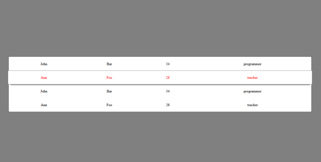
Wow, we finally broke through the table width frontier and our row is expanding nicely beyond the table body. Here is the complete example:
See the Pen Table row highlight make row wider than table by codeVerses (@codeVerses) on CodePen.
